The Ultimate Branding Checklist
Your go-to-branding guide is just a click away!


What is typography and why is it important for your brand?

So you’ve heard people talk about typography but what even is it and why won’t your designer friends stop going on about how important it is?
What is typography?
Typography (noun.) the art or procedure of arranging type or processing data and printing from it.
In essence, typography is arranging text in an engaging, interesting and legible way that gets the message across most appropriately. It includes the layout, spacing, sizes, hierarchy, colour and integration of type across a variety of mediums.
Why is typography important in branding?
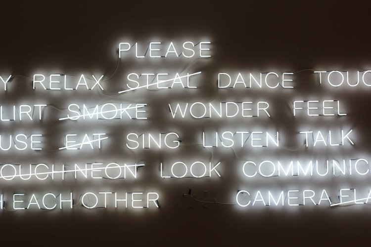
TYPOGRAPHY IS EVERYWHERE
Anything that includes text has some degree of typography involved, whether good or bad. Everything in your brand from your website, logo, social media, posters, signage, packaging, emails, documents or apps to anything else containing words is typographic, making typography a larger part of your visual brand than you may realise. Since it makes up such a large percentage of your brand identity, it’s vital to ensure that it is well-considered.

TYPOGRAPHY IMPACTS EXPERIENCES
The way that people experience your brand is likely through words in many situations. Whether they’re seeing text on your TV ad, reading the about page of your website or looking at the name of your product on the shelf in the supermarket, it’s an experience. As Brian Eisenberg explains, “branding is the subtotal of all the “experiences” your customers have with your business” so in order to create positive connotations for your brand, positive experiences are a must.
According to Nielson, “small font sizes & low-contrast are the #1 complaint for web users...reading online” and we’ve all experienced the strain of trying to read anything that’s too small or difficult to read. These seemingly small and inconsequential typographic mistakes lead to bad experiences and consequently, bad connotations for your brand.
TYPOGRAPHY HAS MEANING
Just like colour has meaning for your brand, typography is equally as powerful in representing the values and tone of your brand. Each classification of typeface has a different set of connotations and therefore will create a different representation of who you are and what you stand for as a brand.
The reason there are so many classifications and kinds of typefaces is that they all give a vastly different mood or effect. For example, sans-serif typefaces are typically modern looking. They’re often clean, simple, easy to read on a large scale and fitting for a lot of things today. On the other hand, serifs are often considered old-fashioned; they look older and give an older vibe, but they are typically known to be easier to read for more long-form content such as blogs and books.
Monospaced typefaces are often used in computer programming and coding, so are going to give a technological vibe to your design. Script fonts feel more hand-written and personal but can vary from cute, modern brush lettering, to quite ornate, fancy calligraphy. Blackletter is associated with the gothic era and therefore feels darker, creepier and a bit moody.
Max Phillips rightly explains that “type is what meaning looks like.” There are so many connotations associated with the typeface you use, so choose wisely, understand why you’re using each one and what it will convey to the reader.
“type is a visual voice. Without reading, it imparts its message”
— Laura Worthington
TYPOGRAPHY BUILDS BRAND RECOGNITION
Like I said before, typography makes up a large percentage of your brand’s visual identity, and can therefore become integral to how your audience perceives and remembers you.
Most of us can remember and instantly recognise the fonts associated with brands such as Coca Cola, Disney and Harry Potter, and may have seen the controversial reactions to brands like Apple, Google and GAP changing their famous typography. Many companies such as Netflix, Airbnb, Apple and Coca Cola have even created their own typefaces in a move to make typography a more considered part of their identity.

Take a look at the brands that you admire or are inspired by and consider their typography. What tone is it setting? How does it make you feel? Is it creating a good experience or not so much? Is it consistent or a bit all over the place? Is it recognisable or forgettable?
Then think about your own business and do an audit of the typography across all of your brand’s touchpoints. Make some adjustments if necessary, learn how to choose the best fonts for your brand and even combine some colour by understanding how to choose an effective brand colour palette. I’d love to hear how that makes a difference to your brand and the experience of your customers!
Pin one of these graphics to save this post for later

June 4, 2018
Typography


more from


The Ultimate Branding Checklist
Your go-to-branding guide is just a click away!

Checking out the bottom of the page? You must be looking for something good. Maker & Moxie® is here for creatives - we want to help you reach more people, feel confident sharing your work, and empower you to keep creating, making, and inspiring the world.