The Ultimate Branding Checklist
Your go-to-branding guide is just a click away!


8 Practical Questions to Ensure a Good Logo Design

LOGO (NOUN): A SYMBOL OR OTHER SMALL DESIGN ADOPTED BY AN ORGANISATION TO IDENTIFY ITS PRODUCTS, UNIFORM, VEHICLES, ETC.
A logo is a flag, a signature, an escutcheon, a street sign. A logo does not sell (directly), it identifies. A logo is rarely a description of a business. A logo derives meaning from the quality of the thing it symbolizes, not the other way around. A logo is less important than the product it signifies; what it represents is more important than what it looks like. The subject matter of a logo can be almost anything.
— Paul Rand
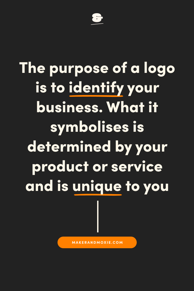
As Paul Rand explains, the purpose of a logo is to identify your business. What it symbolises is determined by your product or service and is unique to you, but no matter what your logo represents, it’s essential that it functions well as a logo in the first place.
Here are 8 questions to ensure that your logo is functional, strong, and effective.
Is it easy to read?
First and foremost, your logo needs to be readable. It’s no use having a fancy logo design if no one can make out your business name, and if they can’t, you will only confuse your audience and never gain brand recognition. Whichever font you choose for your logo needs to be clear enough for your clients and customers to read at both large and small sizes. It’s important to consider your audience here too – young children learning to read, visually challenged people, and elderly generations with worsening eyesight may need even clearer fonts than others, for example.
Does it work in black and white?
While a signature colour can increase brand recognition by 80% and the majority of the time your logo will be seen in your brand colours, there are some situations where you will be limited to either black or white. This makes it vital that your logo works well in both black and white and is still recognisable standing alone, without relying on your brand colours. This is one of the reasons why I always start the logo design process off in black and white, only adding colour once the logo design is finalised.
Does it work in one colour?
There may also be certain situations where you can only use one colour, meaning your logo needs to work without multiple colours, gradients or shading. If your logo depends on a gradient and doesn’t work without it, you’ll be in trouble when it comes to one-colour printing or other similar situations. It’s okay to use gradients, shadows and multiple colours in your logo, but you will need another, one-colour version to use when the situation arises.
Do you have multiple versions?
Speaking of different versions, it’s important to have variations of your logo to use in different situations. For example, if your primary logo is a combination mark made up of text and an icon, you will need a version that just includes the icon to use as your favicon, app icon, or in other smaller situations. Similarly, you might want a version that is just the word mark. Also, if your primary logo is aligned horizontally, you may want a vertical version for situations where horizontal space is limited.
These versions allow for variety in your designs while maintaining a cohesive brand and ensuring that your primary logo isn’t just being squashed into every situation, even if it doesn’t fit.
Does it work at a super small size?
It’s important to consider scale when creating a logo, since it will be used in so many different ways from the tiniest sizes to the largest, and needs to work in each and every situation. Favicons (the icon associated with your website, typically displayed in the address bar or tab of a browser, or next to the site name in a user's list of bookmarks) are typically one of the smallest places that your logo will be used, so this is a good benchmark for reviewing whether your logo works at this size. It needs to still be readable and recognisable, no matter how small it is.
Does it work at a really big size?
Just like a logo needs to work on a small scale, it needs to work equally as well at large sizes. Depending on your business, your logo may end up being used on billboards, buses, planes, signs, and other large surfaces. This means that your logo needs to scale well in terms of design and resolution, remaining crisp, clear and strong regardless of how big it gets.
Does it work on a variety of backgrounds?
A logo should work on every background, whether it’s a photo, pattern, texture, or block colour. You may end up using different versions of your logo for each of these situations, but whatever you decide in the end, this needs to be considered and a solution created.
Does it stand out?
Last but not least, it only takes consumers 10 seconds to form a first impression of a brand’s logo, but it takes 5-7 impressions for consumers to recognise the logo, so you need to stand out. Your logo needs to be strong and unique enough to wow your audience in that first 10 seconds, and be memorable enough for them to recognise you in those next 5–7 impressions.
Although your brand is so much more than just a logo, your logo is a big part of your visual identity, so it’s important to get it right. Asking these 8 practical questions will ensure that whatever form it takes, the function of your logo is strong and effective, allowing your brand to stay concise, cohesive, and consistent.
Pin one of these graphics to save this post for later


May 12, 2019
Logo


more from


The Ultimate Branding Checklist
Your go-to-branding guide is just a click away!

Checking out the bottom of the page? You must be looking for something good. Maker & Moxie® is here for creatives - we want to help you reach more people, feel confident sharing your work, and empower you to keep creating, making, and inspiring the world.